The Science of Visual Merchandising: 10 Principles That Move Product | VIGO DISPLAY
- Share
- publisher
- VIGO DISPLAY
- Issue Time
- Nov 4,2026
Summary
A working guide to the ten visual merchandising principles that survive replication and translate into a fixture specification: the eye-level scan band, the entrance decompression zone, horizontal versus vertical arrangement, contrast, fullness, traffic direction, vertical illuminance at the shelf face, price anchoring, sign hierarchy at reading distance, and physical friction. Includes lighting targets by zone and a four-week single-store test plan.
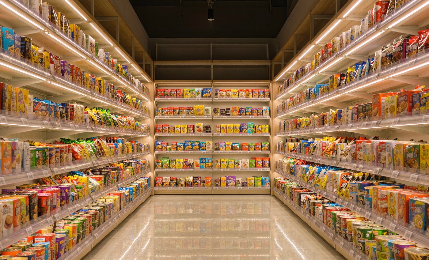
In short
- Visual merchandising works when it is treated as applied perception research, not decoration. The ten principles below each end in a millimeter, a lux value or a tag height.
- The strongest experimental evidence is on shelf arrangement: a horizontal display is easier to process and feels more varied. The lighting figures come from consensus standards, which is a weaker kind of authority than a controlled experiment.
- The weakest evidence is the famous in-store decision percentages, which are widely repeated and poorly sourced. Measure your own store instead.
- Every principle can be tested in a single store in four weeks against a control bay, before it is written into a planogram or a purchase order.
Most visual merchandising advice is aesthetic, and aesthetics do not survive contact with a planogram. What does survive is a smaller set of principles drawn from perception research, retail observation and lighting standards — and each one translates into a decision a factory can actually build: where the product shelf sits in the vertical field, how much of the entrance stays empty, whether options run across the shelf or stack up it, how far the back panel sits from the pack in tonal value, how full the front row is allowed to look, which direction shoppers are nudged, what the light measures at the shelf face, which number they read first, how far away the sign is still legible, and how much physical effort the pick takes. That is the whole discipline, and it is measurable.
Why psychology beats aesthetics
A display has two audiences and they look at it from different distances. From three meters, the shopper reads the shape, the color and one line of copy; that judgment takes about two seconds, and it decides whether they turn into the aisle at all. From one meter, they read the product, the variant and the price. Almost every expensive mistake in retail fixturing is a fixture designed for the first read and not the second: a sculptural unit that photographs beautifully and puts the product at shin height.
The useful reframing is that a display is a device for directing attention and removing effort. Attention is limited and directional — the eye goes to edges, contrast and faces, and it skips flat, uniform areas. Effort is physical — reach, weight, two-hand release, a stoop. A principle is worth adopting when it changes one of those two things and can be specified in numbers. That filter removes most of what gets called visual merchandising, and it keeps the ten items below.
One caution before the list. The figure that "70–80% of purchase decisions are made in store" circulates in almost every retail deck and traces back to studies from a different retail era with methods that are rarely published. It is directionally plausible and numerically unreliable. Nothing in this article depends on it, and you should be suspicious of any merchandising proposal that does.
The ten principles, in the order a shopper meets them
1. Eye level is the buy zone
The band between roughly 1.2 m and 1.6 m above the floor is what an adult shopper scans without moving their head. Below knee height, product reads as bulk storage; above about 1.7 m, it reads as backstock, even when it is the same SKU. That single fact sets the height of the product shelf, the header and the price rail, and it explains why a 1.8 m floorstanding unit that looks generous in a rendering often underperforms a 1.4 m unit that puts the product into the scan band. The extra height is usually filled with branding the shopper never looks at.
Measure the actual bay before accepting any drawing. Fixture heights that suit a big-box store with 2.1 m gondolas often sit too tall for a convenience format, and a unit designed for one will not fit the other.
2. The first few meters are a transition, not a sales floor
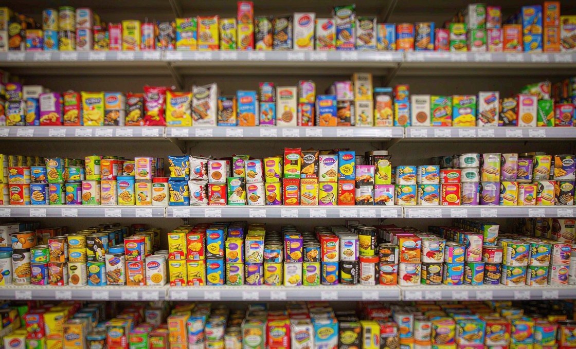
Paco Underhill's decompression zone — the first 10 to 15 ft (3 to 4.5 m) inside the door — is where shoppers are still adjusting to the light, the temperature and the layout. Underhill's own figure for the downshift is about 15 ft, so several paces pass before anyone is actually shopping. Signs and product in that band register less than almost anything deeper in the store. Put a two-meter display wall there and you have bought a wall.
The fixture consequence is specific: entrance units stay below about 1.1 m, open on all four sides, carrying one message at most, positioned to keep a clear sightline to the anchor category at the back. A low table does the job that a tower is usually hired for.
3. Options run across the shelf, variants stack up the wall
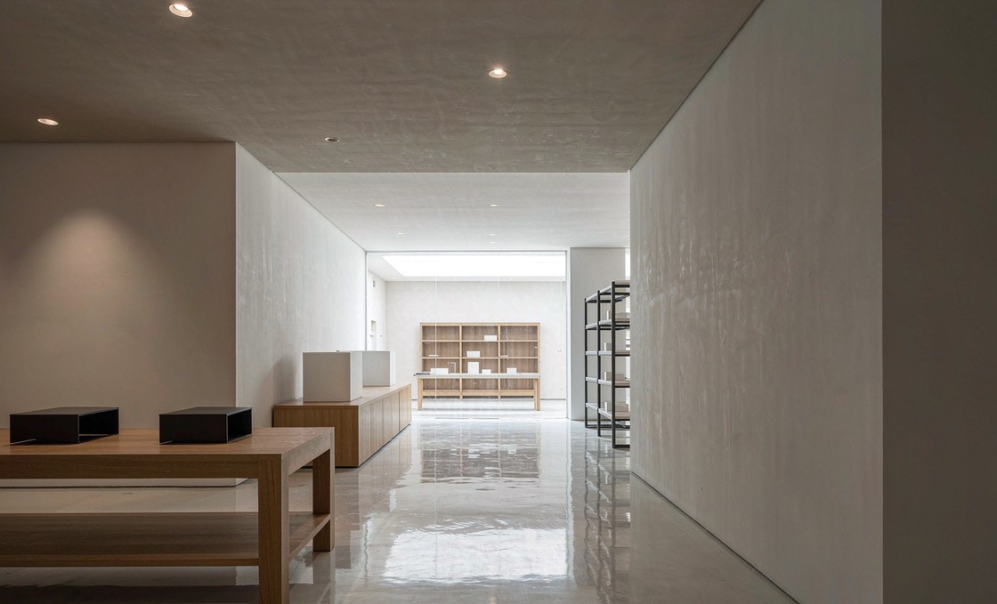
Across two field studies, an eye-tracking study and two lab studies, Deng, Kahn, Unnava and Lee (2016) found that the same options arranged horizontally are easier to process, are perceived as more varied, and lead to more variety being chosen than when they are arranged vertically. The mechanism is straightforward: the human visual field and the dominant direction of eye movement are both horizontal, so scanning left to right is simply cheaper. Their boundary condition is worth knowing too — when the task is to pick one single most-preferred item rather than a basket, the advantage disappears. Pizzi and Scarpi (2016) found the merchandising version of the same result: displaying assortment breadth horizontally and depth vertically made the selection look larger and raised decision satisfaction.
In a fixture, that means shelf-ready trays present the range left to right, while wall bays stack the variants of one item vertically. The failure mode is the display that stacks two different products side by side, one facing each, and calls it a range: it reads as two options, not twenty.
4. Contrast is a fixture decision, not a packaging decision
A shopper identifies a product by the edge between it and its background. White pack on a white shelf disappears at two meters; the same pack on a charcoal back panel reads instantly. Two rules cover most cases: hold the bay to about three color families, and set the back panel at least three steps away in tonal value from the dominant pack color.
Finish matters as much as color. A black gloss back panel under a single downlight produces a specular hotspot that hides whatever sits in front of it — the brightest surface in the bay becomes the one thing the shopper cannot see past.
5. Fullness reads as availability
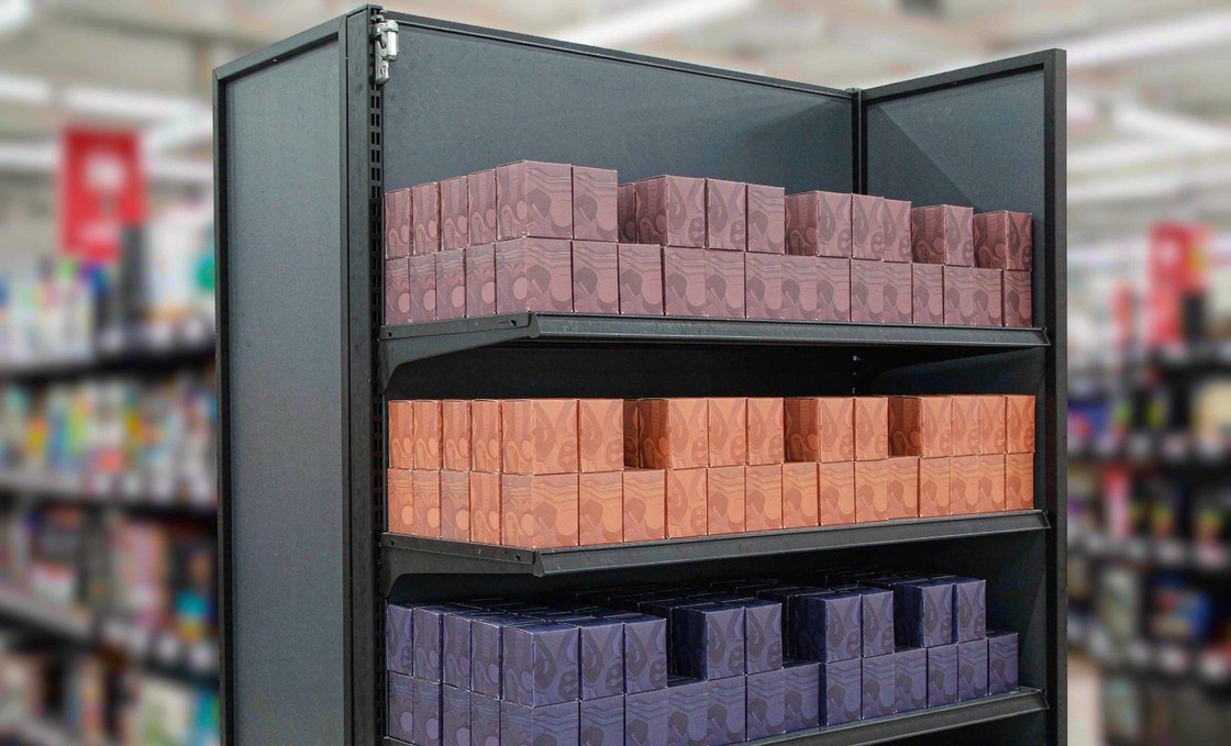
A shelf filled to the front edge signals that the product is in stock and moving; a front row at half depth reads as picked over, and shoppers skip it — often without being able to say why. This is the commercial reason shelf-ready packaging and spring-loaded pushers exist: they keep the front face present without anyone facing the shelf by hand.
Two operating limits matter more than the principle itself. Fill to about 10 mm behind the shelf edge so packs are not knocked by carts, and never let the front row fall below roughly 60% of the shelf depth before restocking. Over-filled shelves look abundant and handle badly.
6. Traffic turns right, then runs counterclockwise
Underhill's "invariant right" is the reflex turn to the right as a shopper comes through a door; in right-hand-traffic markets that turn sets up a broadly counterclockwise path, which is why the wall immediately past it carries the highest value per square meter. Treat it as a default to test rather than a law: it reverses in left-hand-traffic markets, and a checkout line, a bright anchor at the back or a strong architectural cue will override it.
The fixture consequence is simpler than the debate. The first unit after the turn should carry the seasonal story; the units deeper along the path should carry replenishment SKUs that people are already looking for.
7. Measure light at the shelf face, not on the floor
Retail lighting is usually specified, measured and signed off on horizontal illuminance — the floor — but the shopper reads a vertical surface. ANSI/IES RP-2-20 keeps the two separate: a base level for circulation, a higher level for general merchandise, and several times that again for feature and premium displays. EN 12464-1 is the more quotable of the two because it publishes single numbers: 300 lx for a general sales area, 500 lx at the checkout, and Ra ≥ 80 for both.
Color rendering is the other half. Ra ≥ 80 is the floor the standards actually set for merchandise; fresh food and premium categories are usually specified higher, at Ra ≥ 90 with a usable R9, because the general index averages eight pastel samples and ignores saturated red — the color that decides whether beef looks fresh or tired. A store that measures 500 lx on the floor and a fraction of that on the shelf face looks dim exactly where the money is spent.
| Zone | Horizontal | Vertical at shelf face | Color rendering |
|---|---|---|---|
| General merchandise aisle | 300 lx (EN 12464-1 minimum) | brief it separately, measure at the shelf | Ra ≥ 80 |
| Feature display / endcap | several times the circulation level | the accent plane is the reading surface | Ra ≥ 80 |
| Checkout and counter | 500 lx (EN 12464-1) | light the counter, not the ceiling | Ra ≥ 80 |
| Fresh produce and chilled | 500–750 lx typical | as high as the source allows | Ra ≥ 90, R9 ≥ 50 |
| Premium and fashion | 500–750 lx typical | accent to the garment face | Ra ≥ 90 |
8. The first number sets the reference
Anchoring is one of the more durable findings in behavioral economics: an initial number pulls later judgments toward it, even when it is arbitrary (Tversky and Kahneman, 1974). In a display, the anchor is whatever the shopper reads first — the multi-unit price, the larger pack, the comparison price. Set that number deliberately rather than letting the layout decide it, and keep the unit price inside the same reading block so the comparison stays honest.
At the fixture level this is a tag-rail decision: one continuous rail at a consistent height, deep enough for two lines of text, positioned so it never covers the product's own claim. A rail that clips the front of the pack is a design error that repeats across an entire chain.
9. One message, sized to the distance
Signage in an aisle is read at walking speed from six to ten feet (2 to 3 m); a header on an endcap is read from ten to thirteen feet (3 to 4 m) across the aisle. Hierarchy that survives that speed is short: brand cue, then offer, then price, then detail — and most displays should stop after the second. Character height has to scale with distance, which is why a header that reads comfortably on a laptop mockup is unreadable from the far end of the aisle.
A working floor for a header read at three meters is about 25–30 mm cap height — the sign trade's rule of thumb is roughly one inch per ten feet of viewing distance — with no more than two type sizes on the panel. Two promotions need two panels in two places, not one crowded board.
10. Remove the physical friction
Attention is wasted if the pick is awkward. Underhill's butt-brush effect — shoppers abandoning a position when they are brushed from behind — is the reason aisle width gets specified at all. The working minimum at a busy fixture is about 3.5 to 4 ft (1.05 to 1.2 m) clear, which is design practice rather than a number from his research; the accessibility floor underneath it is 36 in (0.9 m). Heavy items belong below waist height, hooks should release with one hand, and nothing should require reaching above 1.8 m.
This is the principle most often lost between design and production, because friction is invisible in a rendering. A hook that looks clean on screen but needs two hands to release costs more sales than a color scheme gains — and it is the kind of detail a factory can catch before tooling, if the drawing carries the requirement.
| Principle | What it changes | Specification | How you notice it failed |
|---|---|---|---|
| 1. Eye level | Product height | Product face 1.2–1.6 m | Product at shin height, header above 1.7 m |
| 2. Decompression | Entrance layout | Units ≤ 1.1 m in the first 4.5 m | A tall unit in the doorway nobody stops at |
| 3. Arrangement | Shelf direction | Range across, variants up | Two SKUs side by side, one facing each |
| 4. Contrast | Back panel | Three value steps; ≤ 3 color families | Pack disappears at two meters |
| 5. Fullness | Fill discipline | 10 mm behind the edge; ≥ 60% depth | Holes in the front row that stay |
| 6. Circulation | Story placement | Story unit just past the right turn | Same unit position in every store |
| 7. Light | Lighting brief | 300 lx horizontal (EN 12464-1); vertical briefed and measured separately | Bright floor, dim shelf face |
| 8. Anchoring | Price presentation | Anchor pack first, unit price adjacent | Rail covering the product claim |
| 9. Sign hierarchy | Panel content | Two type sizes, 25–30 mm cap at 3 m | Five messages competing on one panel |
| 10. Friction | Hook and height spec | 3.5–4 ft aisle, heavy below waist | Two-hand release, reach above 1.8 m |
What the evidence actually supports
It is worth separating four tiers of claim, because merchandising writing usually mixes them.
Peer-reviewed and replicated. The horizontal-versus-vertical arrangement effect is the strongest item on the list: measured in the field as well as in the lab, and traceable to a visual-processing mechanism rather than a preference. It does have a boundary condition worth knowing. A 2018 study with Japanese participants, who read both vertically and horizontally, found the horizontal advantage was eliminated; when those participants read vertically first, the advantage reversed to favor the vertical display. Display direction is not a universal law — it is a fit to the reader. Anchoring is in the same tier.
Standards-based. Lighting numbers come from consensus documents that are revised on a cycle: ANSI/IES RP-2-20 in North America, EN 12464-1 in Europe. They are guidance rather than law, but they are the documents most retail lighting specifications are written against, which makes them the right thing to specify.
Observational and directional. The decompression zone and the invariant right come from structured observation of shoppers — thousands of hours of it, but not controlled experiments. They are excellent defaults and poor dogma, which is why the next section matters.
Working convention. The rest of the numbers here — the 1.2–1.6 m band, the 10 mm fill margin, the 60% depth floor, the 25–30 mm cap height, the 3.5–4 ft aisle — come from fixture practice, not from controlled studies. They are worth using because they are precise enough to check, not because they are proven. The test plan below exists for exactly that reason: a convention you have verified in your own store beats a study you have only read about.
Three principles that get copied badly
Contrast. The lesson "dark background makes product pop" turns into a chain full of black fixtures, which flattens everything: when every back panel is charcoal, no product has an edge anymore. Contrast is relative. Use it where the pack is pale, and leave the rest of the store lighter.
Fullness. The lesson "full shelves sell" turns into shelves loaded past the edge, which produces damaged packs, blocked sightlines to the tier below, and a fixture that cannot be restocked without pulling product forward by hand. Fill to the edge minus a margin, and let pushers do the facing.
Lighting. The lesson "accent lighting sells product" turns into accent everywhere, and then nothing is accented, because the eye reads relative brightness. The accent ratio only works if the rest of the aisle stays at base level.
Validating in one store
None of these principles need a national rollout to test. A single store with two comparable bays and a four-week window will tell you whether a change is real, provided you fix the measurement before you install anything.
| Measure | How to collect | Minimum sample | Read as real if |
|---|---|---|---|
| Units per 1,000 shoppers | Door counter plus POS, same hours daily | 2 weeks per cell, ~1,000 shoppers | Up more than 10% and holds in a second cell |
| Sales per linear meter | Planogram map plus POS by SKU | 4 weeks, control bay running | Up more than 15% against control |
| Pick-up rate at the fixture | 30-minute observation counts, three times a day | 20 hours spread across weekdays and weekend | Same direction on at least two of three days |
| Front-row availability | Hourly photo audit of the same bay | 2 weeks | Front row stocked above 90% of checks |
| Dwell at the unit | Video count or in-person stopwatch | 200 passers-by | Median dwell up by three seconds or more |
Two rules keep the test honest. Swap the fixture between bays halfway through, so a good position cannot masquerade as a good design. And write down the threshold before you start, because every merchandising change looks like it worked in the first week of novelty.
Where these principles break down
Regulated categories. In pharmacy and some food categories, planogram rules, mandatory information placement and category-specific regulation override most of the list. The principle to keep is friction, not hierarchy.
Apparel. Size runs are a range, and the shopper's first question is availability in their size, not which variant to choose. Eye-level placement still matters, but a full size run beats a beautiful block every time.
Big-box and warehouse formats. With ceilings at seven or eight meters, the eye-level band repeats at several heights and the shopper's scan pattern is different: they read at distance first and close up second, so the header does far more work than the shelf.
Retailer-owned bays. If the retailer supplies the fixture, a supplier's display has to fit inside an existing bay width, depth and load rating. Design to the smallest bay you will meet, not the average one — and confirm the bay drawing before tooling, not after.
Frequently asked questions
Does visual merchandising actually increase sales, or is it just design?
Both, and the difference is measurable. Changes to arrangement, contrast and availability alter what shoppers pick up; changes to finish and styling mostly alter how the store is perceived. The first group shows up in units per 1,000 shoppers within two weeks. The second shows up in surveys, if at all. Spend on the first group before the second.
What is the single highest-return change?
Getting the product into the 1.2–1.6 m band and keeping the front row full. It costs almost nothing where the shelf already exists — it is a planogram decision, not a purchase — and it acts on both attention and availability at once. Most stores that measure it find one or two tiers carrying product that belongs higher or lower.
How much does a display fixture cost per store?
It depends on service life more than on size. A temporary corrugated unit and a permanent steel-and-MDF unit differ by an order of magnitude, and both can be correct for different promotions. The useful number is cost per store per month in position, not unit price — a fixture that lasts three years and one that lasts three weeks are not comparable line items.
How do I prove a display worked?
Compare a treated bay against a control bay in the same store, before and after, using units per 1,000 shoppers rather than raw sales, because store traffic moves for reasons that have nothing to do with the display. Four weeks, with the fixture swapped between bays halfway through, is enough to see a 15% effect. Anything shorter is a story.
Do these principles apply to a small store?
They apply more strongly, because a small store has fewer bays to absorb a mistake. The two that matter most are the decompression zone — small formats tend to fill the entrance first — and fullness, since a small shelf that looks picked over reads as a thin assortment rather than a busy one.
Primary references and further reading
Where a figure in this article can be checked independently, such as an illuminance target or a published experiment, it is cited below. Bay heights, aisle widths and planogram rules vary by retailer and market, so measure the store you are actually shipping to.
- Deng, X., Kahn, B. E., Unnava, H. R. and Lee, H. (2016). A "Wide" Variety: Effects of Horizontal versus Vertical Display on Assortment Processing, Perceived Variety, and Choice. Journal of Marketing Research, 53(5), 682–698.
- Pizzi, G. and Scarpi, D. (2016). The effect of shelf layout on satisfaction and perceived assortment size: An empirical assessment. Journal of Retailing and Consumer Services, 28, 67–77.
- Ariga, A. (2018). Reading habits contribute to the effects of display direction on product choice. PLoS ONE, 13(12), e0209837 — the boundary condition on the horizontal display advantage.
- Underhill, P. (1999). Why We Buy: The Science of Shopping. Simon & Schuster — the source of the decompression zone and the invariant right.
- Tversky, A. and Kahneman, D. (1974). Judgment under Uncertainty: Heuristics and Biases. Science, 185(4157), 1124–1131.
- ANSI/IES RP-2-20 (2020), Recommended Practice: Lighting Retail Spaces, Illuminating Engineering Society.
- EN 12464-1:2021, Light and lighting — Lighting of work places — Part 1: Indoor work places, CEN.
- ISO 9001, Quality management systems, International Organization for Standardization — the certification our production lines are audited against.
Related reading: What Is a POP Display? covers the formats and where each one belongs, and Industry Insights covers sourcing models, material comparisons and cost structure. We hold CE and ISO 9001 certification and are REACH compliant; our plant covers 6,000 square meters with four in-house material lines and a minimum order quantity of 100 pieces.